July 1, 2024 · 4min read
Uncovering the Threat of First Party Fraud in Banking


First party fraud is a significant threat to the banking sector. This subtle type of fraud poses a substantial risk to financial institutions, affecting their bottom line and eroding trust between banks and their customer base.
In this post, we’ll delve into the nuances of first-party fraud, explore examples in the banking sector, and outline preventive measures to safeguard against this insidious threat.
What is First Party Fraud?
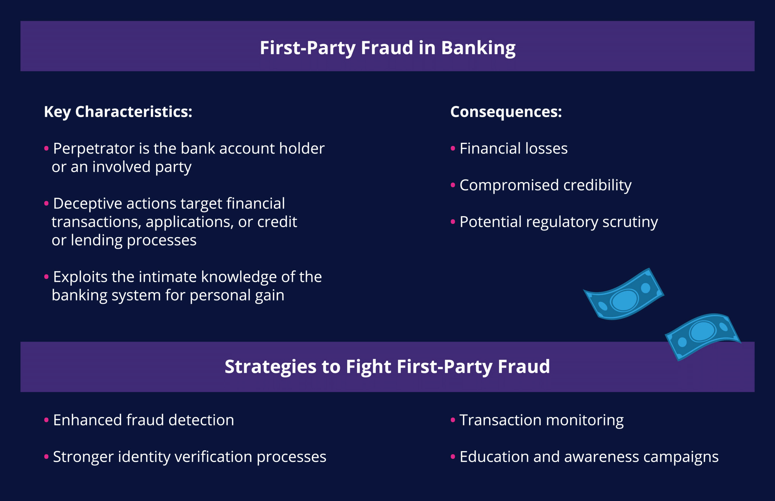
First party fraud is a deception wherein individuals misrepresent themselves to commit fraudulent activities, directly impacting financial institutions.
How to Choose a Machine Learning Platform for Risk
Download the ultimate guide to selecting a machine learning vendor for fighting fraud and financial crime.
This makes detection more challenging, as the fraudster may have an inside knowledge of a bank’s processes and can disguise fraud as legitimate transactions by a genuine account holder. Because the transactions include accurate information and present seemingly innocent intentions, it is not always easy for the bank to raise a red flag.
First party fraud also goes by several other names. These names include friendly fraud, first-person fraud, and customer self-fraud. In the merchant space, meanwhile, this type of fraud is increasingly referred to as “first party misuse” while the term “friendly fraud” is being phased out. After all, there’s nothing friendly about this type of fraud.
Examples of First Party Fraud in Banking
First-party fraud in banking takes many forms, including:
- Application Fraud . Application fraud involves individuals falsely claiming information on credit or loan applications. By providing inaccurate details about their financial situation, employment status, or other critical factors, these fraudsters secure loans or credit they would otherwise not be eligible for.
- Chargeback Fraud . In this scenario, the account holder commits first-party fraud by disputing a legitimate transaction with the credit card company or financial institution. This often takes the form of falsely claiming that goods were lost in transit, never delivered, or that the received items were significantly different from what was expected, leading to a request for a refund.
- Payment Fraud . In this scenario, a customer pays a known associate or accomplice and then falsely claims the transaction was fraudulent. This risk is expected to accelerate, especially as mandatory scam reimbursement policies like those in the UK take effect in other regions.
- Bust-out fraud . In the banking sector, bust-out fraud involves individuals intentionally accumulating credit or financial obligations with the intention of defaulting or disappearing. This deceptive practice is sometimes classified as ”bad debt” instead of fraud, making detection even more difficult.

Changing Attitudes About First Party Fraud in Banking
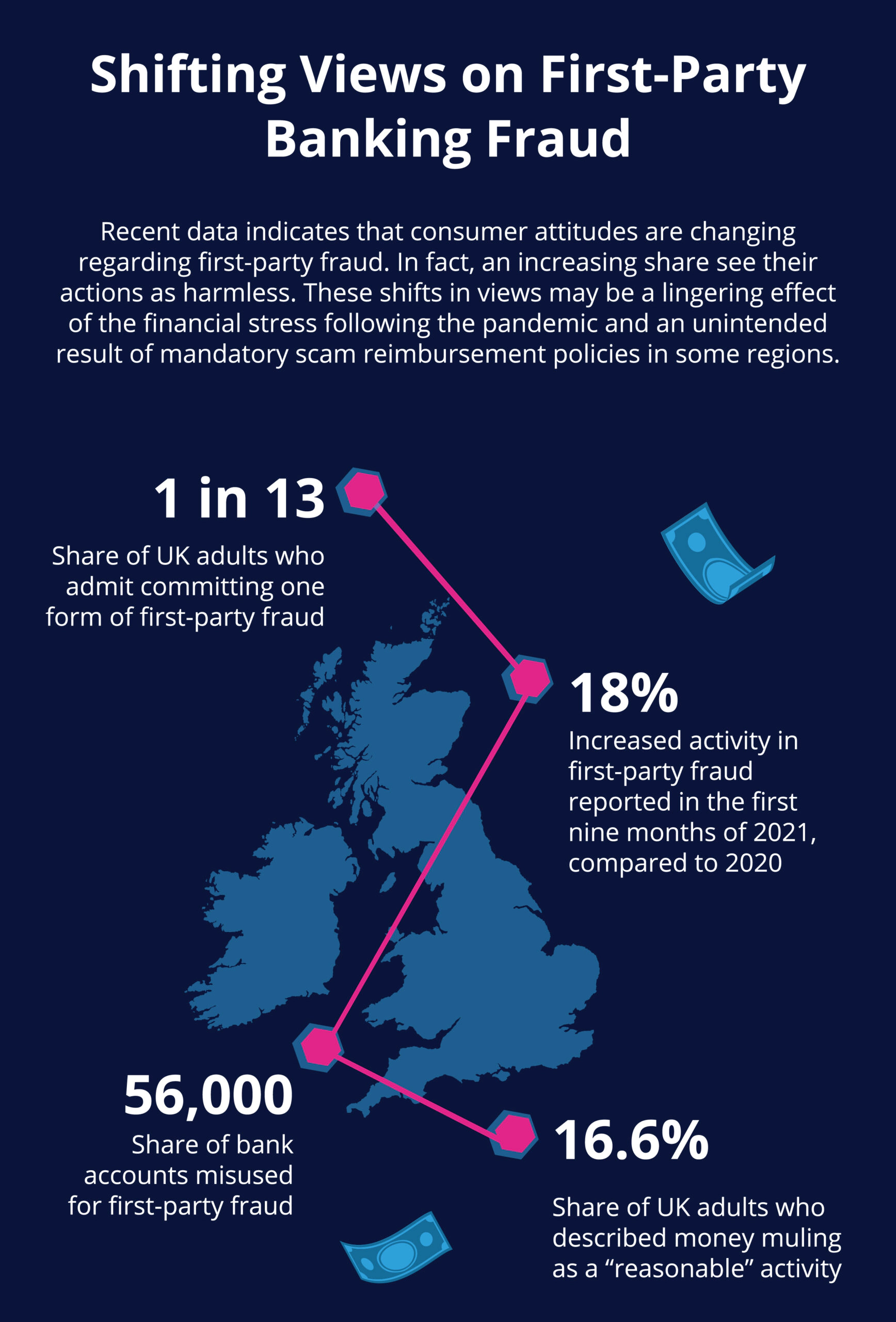
One of the critical reasons that first party fraud in banking is so concerning for the industry is recent shifts in consumer attitudes. More to the point, recent research indicates that public views on first party fraud have experienced a significant shift. These changes were partly driven by technological shifts experienced during the COVID-19 pandemic and changing customer behaviors.
Regulatory policy changes are also expected to contribute to a rise in first party fraud (although unintentionally). The United Kingdom’s Payment Systems Regulator (PSR) will soon require banks to reimburse scam victims for losses in almost all cases, with liability split evenly between sending and receiving banks. PSR’s policy is a significant change in how scams have been addressed and is a response to rising scam activity.
However, the unintended consequence of mandatory scam reimbursement may be that more individuals are willing to exploit it for their own gain. For example, they may falsely claim fraudulent activity occurred, knowing their bank is obligated to reimburse them. In other words, PSR’s new policy may incentivize some people to commit first party fraud.

How Feedzai Prevents First Party Fraud
These changing consumer attitudes and policy regulations indicate that first party fraud activity is on track to surge. It’s more important than ever for banks and financial institutions to catch first-party fraud and avoid losses from fraudulent reimbursements and returns.
Here’s how Feedzai’s solution helps banks protect themselves from first party fraud.
- Enhanced Fraud Detection. Robust fraud detection mechanisms are paramount. Feedzai utilizes a combination of advanced analytics, artificial intelligence, and machine learning to help banks identify irregular patterns of behavior and flag potential instances of first-party fraud before they result in losses.
- Transaction Monitoring. Feedzai’s machine learning solutions constantly monitor transactions for unusual patterns or suspicious activities. This proactive approach quickly identifies and prevents first party fraud. Real-time alerts and automated monitoring systems can aid in swift response and mitigation.
- Education and Awareness . Feedzai also helps banks educate their staff and customers about the risks of first party fraud. This can involve highlighting fraudsters’ common tactics and providing guidance on spotting and reporting suspicious activities.
First party fraud poses a significant threat to the banking sector, with potentially severe consequences for financial institutions and their clients. By understanding the nuances of this form of fraud and implementing proactive measures, banks can fortify their defenses and protect their bottom line. Vigilance, technological innovation, and a commitment to education are critical elements in the ongoing battle against first-party fraud, ensuring a secure and trustworthy financial ecosystem for all stakeholders involved.
Here are additional resources for fraud prevention and detection:
- Article: 3 Tips for Banks to Catch Synthetic ID Fraud
- Resource: Value-Added Services: Maximizing Revenue through Fraud Prevention
- Solution Guide: Prevent and Detect Payments Fraud with Feedzai
- Solution: Feedzai’s Transaction Fraud Detection
All expertise and insights are from human Feedzaians, but we may leverage AI to enhance phrasing or efficiency. Welcome to the future.